
YaRrr! The Pirate’s Guide to R
After teaching several introductory courses on R, I have come to realize that the best way to get people excited about programming is to follow two rules. Rule 1: Make it simple for them to get started. Rule 2: Make it fun. The yarrr R package is designed to follow these rules.
One of the main tools in the yarrr package is the pirateplot(). The purpose of the pirateplot was to answer the following question: How can I quickly understand the relationship between one or more categorical independent variables and a continuous dependent variable? This question comes up quite often in experimental research using factorial designs. For example, an experiment might compare four different experimental conditions (a, b, c, and d) on a dependent variable (y).
The standard way to visualize a factorial design is a bar plot like the one shown in Figure 1. A bar plot shows the mean of each distribution with error bars. Bar plots are standard practice because they are simple and easy to create with any statistical software. They also provide a picture of the data that appears straightforward. On our bar plot, it looks like there was no difference between conditions on the dependent variable. Indeed, an analysis of variance on these data will confirm this conclusion with a p value of .939.
But is this conclusion justified? No. The problem is that our data-visualization tool, the bar plot, obscured important patterns in the data by hiding the raw data underlying each group. Statisticians have shown again and again that because bar plots hide raw data and distributional information, they obscure important patterns in data, from multiple modes to outliers. Yet despite this overwhelming evidence that bar plots are insufficient for conveying patterns in data (Cleveland, 1984; Lane & Sándor, 2009; Weissgerber, Milic, Winham, & Garovic, 2015), we are still routinely publishing bar plots in our top journals (Cooper, Schriger, & Close, 2002).
Why are we still using bar plots to visualize data? Although there are bar plot alternatives such as violin plots (Hintze & Nelson, 1998) and bean plots (Kampstra, 2008) that show distributional information, most people simply don’t know what they are or how to create them. Or, if they do know about the alternatives, they simply are not motivated to use them because they either are not simple to get started with (Rule 1) or are not fun (Rule 2).
The pirate plot is designed to be a replacement for bar plots that people will actually want to use. Unlike a bar plot, which shows only descriptive statistics (and possibly some inferential statistics in the form of a confidence interval), a pirate plot simultaneously shows three key aspects of the data: the raw data (shown as individual points), the descriptive statistics (shown as lines), and the inferential statistics (Bayesian highest-density intervals or frequentist confidence intervals, and smoothed densities). A pirate plot of our data is shown in Figure 1 next to the bar plot. Here, we can clearly see patterns in the data that the bar plot missed. For example, we see that conditions b and c have two distinct subgroups, whereas conditions a and d appear to be truly identical. Thanks to the pirate plot, we can immediately see that our previous conclusion about the data, supported by both a bar plot and an analysis of variance, was wrong.
Importantly, the pirate plot follows the two rules of getting people excited about programming. First, it is easy to get started. Once you load the relevant data, you can create a pirate plot simply by typing pirateplot(y~condition, data=data). Second, pirate plots are fun to use. For example, by including the theme and pal arguments, you can customize your pirate plot with colors inspired by movies and TV shows, including my favorite childhood Saturday morning cartoon, X-Men. In Figure 4, you can see four different versions of plots from exactly the same data created with pirateplot() by adding the theme and pal arguments. The color palettes in the yarrr package are not restricted to a pirate plot. All of the palettes are contained in the piratepal() function and can be easily used in any plot you’d like, such as the scatter plot in Figure 3 using the My Little Pony palette.
I have found that students are much more excited about data when they see it presented in a colorful, informative pirate plot than when it is reduced to a dull bar plot. Indeed, even though I created pirate plots for my students, I find myself using them almost daily in my own analyses. Plots created or inspired by the pirate plot are already being used in publications (Wagenmakers, Beek, Dijkhoff, & Gronau, 2016) and even in research departments at companies such as Pandora.
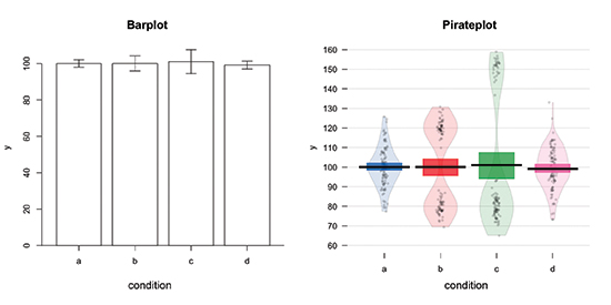
Fig. 1
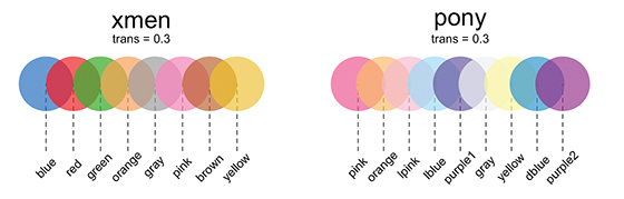
Fig. 2
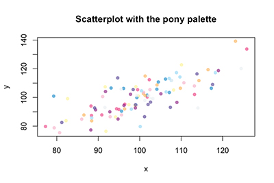
Fig. 3
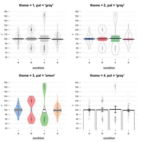
Fig. 4
References
Cleveland, W. S. (1984). Graphs in scientific publications. The American Statistician, 38, 261–269.
Cooper, R. J, Schriger, D. L., & Close, R. J. H. (2002). Graphical literacy: The quality of graphs in a large-circulation journal. Annals of Emergency Medicine, 40, 317–322. doi:10.1067/mem.2002.127327
Hintze, J. L., & Nelson, R. D. (1998). Violin plots: A box plot-density trace synergism. The American Statistician, 52, 181–184.
Kampstra, P. (2008). Beanplot: A boxplot alternative for visual comparison of distributions. Journal of Statistical Software, 28, 1–9.
Lane, D. M., & Sándor, A. (2009). Designing better graphs by including distributional information and integrating words, numbers, and images. Psychological Methods, 14, 239–257. doi:10.1037/a0016620
Wagenmakers, E.-J., Beek, T., Dijkhoff, L., & Gronau, Q. F. (2016). Registered replication report: Strack, Martin, & Stepper (1988). Perspectives on Psychological Science, 11, 917–928. doi:10.1177/1745691616674458
Weissgerber, T. L, Milic, N. M., Winham, S. J., & Garovic, V. D. (2015). Beyond bar and line graphs: Time for a new data presentation paradigm. PLoS Biology, 13, e1002128. doi:10.1371/journal.pbio.1002128

